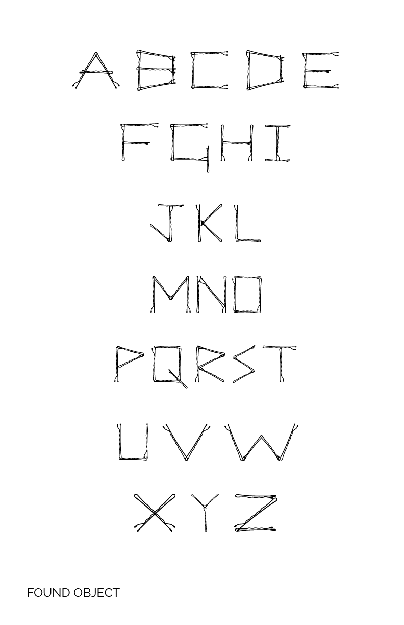

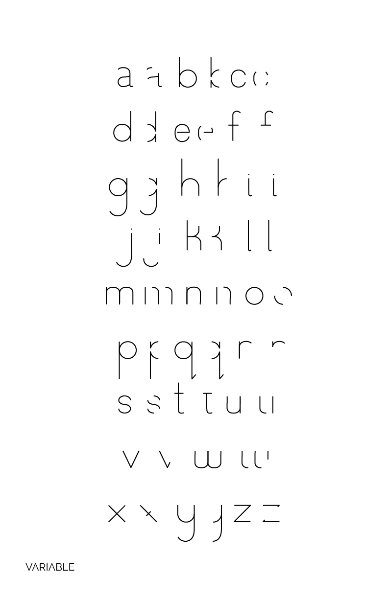
Above are three typeface that I created based on either a system, found object, or a variable. For the found object I used bobby pins to create a more boxy typeface. Four leaf clovers were used as my inspiration to create my system typeface. Each letter uses shapes and movements from a variety of clovers I have found over the years. Finally my idea for the variable typeface was for parts of the letters to slowly start to disappear. This challenged the legibility. I focused on the part of the letters that I felt stood up and ultimately would be most recognizable when alone.

For my senior thesis, the focus was on "cancel culture." In 2020, it felt as if "cancel culture" was at its peak of power. The general public jumped at the opportunity to cancel public figures and celebrities who did things that they felt were not socially acceptable. While also having a long history of interest in pop culture, I was drawn to this topic because of the conversations it created. With the remarks and comments made against these public figures and celebrities, I was constantly reminded of the saying we were taught at a young age: "Two wrongs don't make a right."
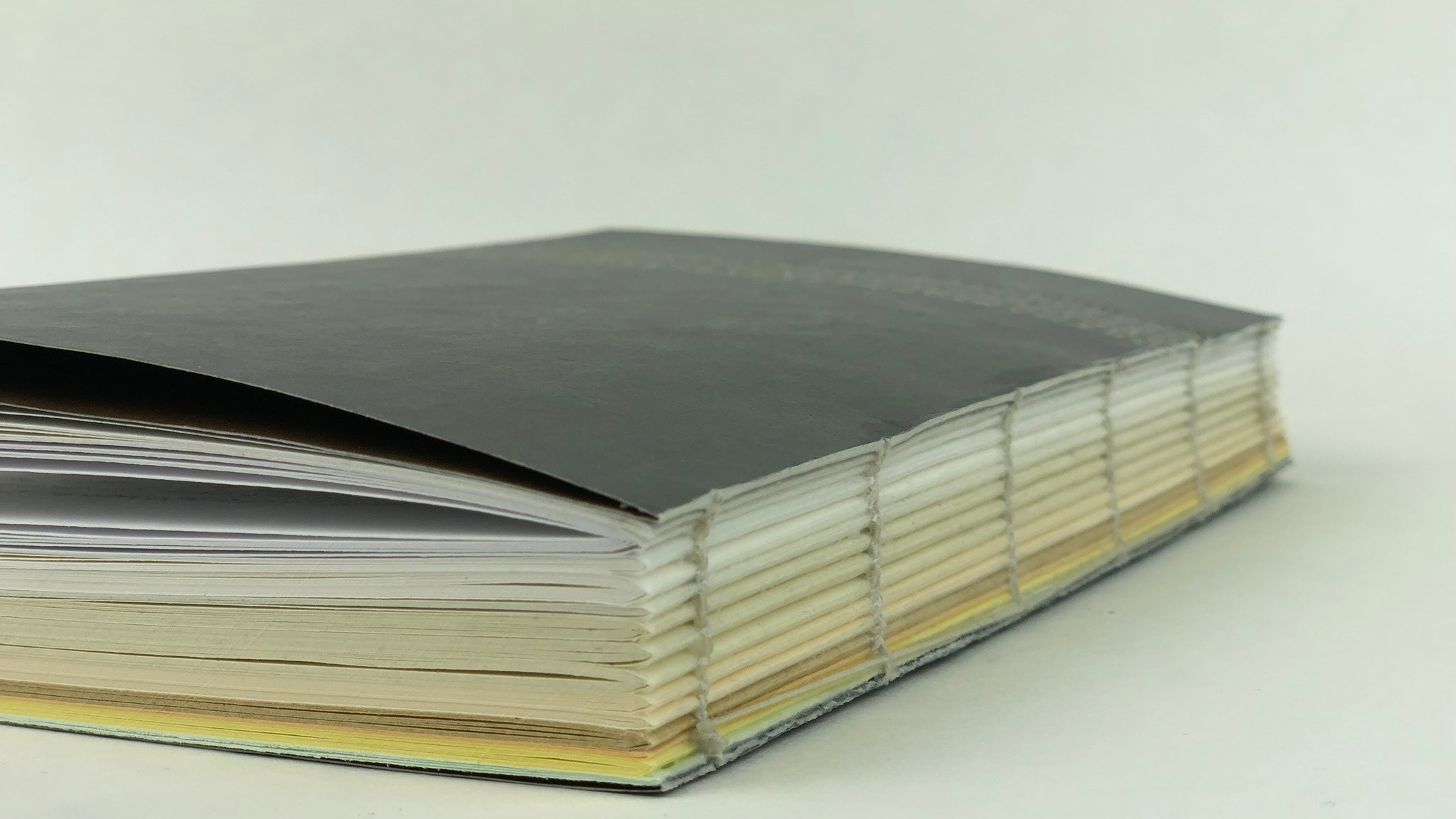
In each of the scenarios, I focused on a range of different figures and situations varying in controversy. My intention was not to insert my opinion but rather present the information. I did this by creating a poster and book series. The poster series includes 3 quotes about their experience and/or perspective on "cancel culture." I created a custom hand-made font to highlight a key part of the quote. The inspiration behind this font came from the idea that situations are not always black and white. Along with this, "cancel culture" prominently lives online where users who actively participate in this trend can live in the shadows and be protected by hiding behind their screens.
In each of the scenarios, I focused on a range of different figures and situations varying in controversy. My intention was not to insert my opinion but rather present the information. I did this by creating a poster and book series. The poster series includes 3 quotes about their experience and/or perspective on "cancel culture." I created a custom hand-made font to highlight a key part of the quote. The inspiration behind this font came from the idea that situations are not always black and white. Along with this, "cancel culture" prominently lives online where users who actively participate in this trend can live in the shadows and be protected by hiding behind their screens.
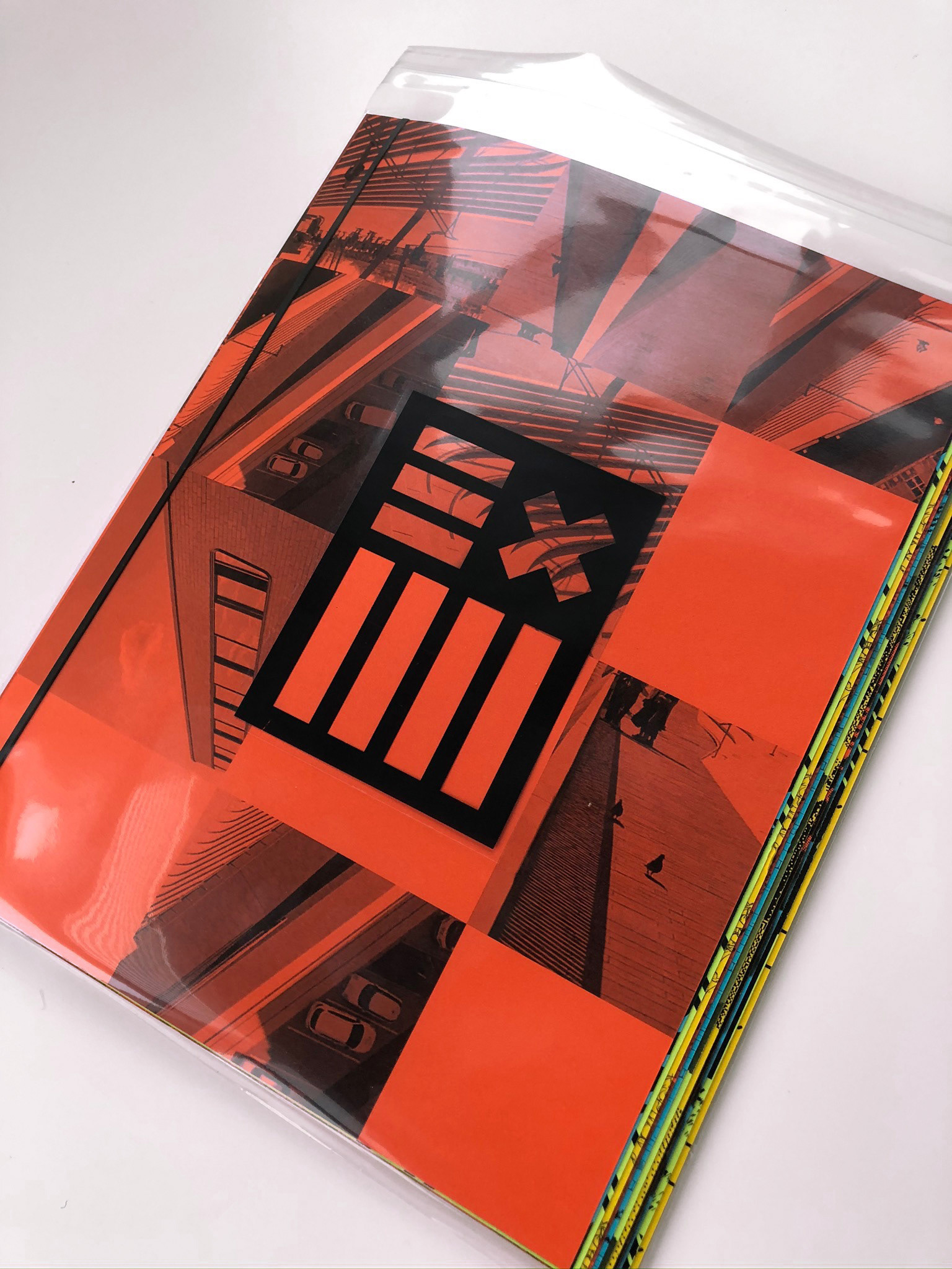
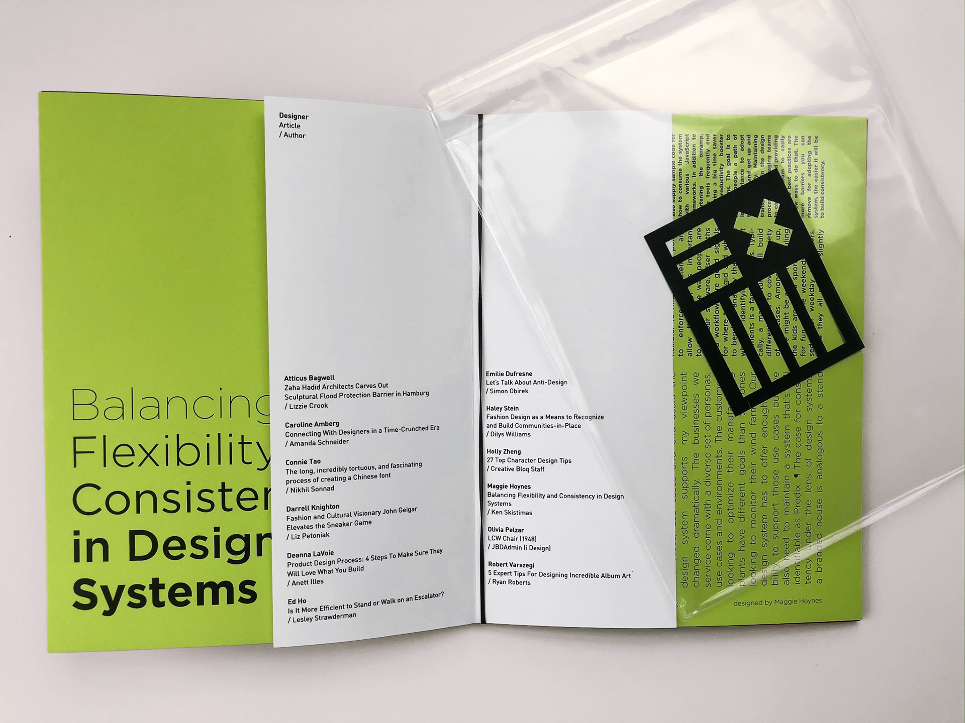
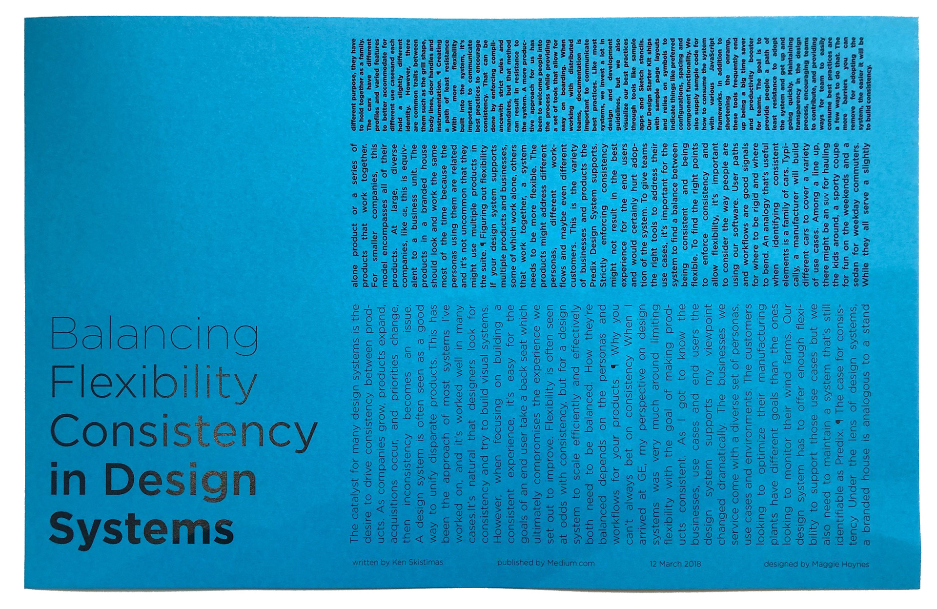
As a final brief my classmates and I created a zine with articles that interested us within the umbrella of design. The article I picked was "Balancing Flexibility Consistency in Design Systems." This article interested me because while gaining a higher level of interest in identity systems, I wanted to learn more on how I can apply a singular design to multiple products and collateral. While designing this layout I focused playing with the idea of balance and inconsistency. I did this by changing font size, weight, and the text boxes.